A Century of Wonder: The History and Evolution of the Walt Disney Logo
More than just a logo, the “Walt Disney Pictures” design is a cultural icon, instantly recognized by generations across the globe. It’s the shimmering castle, the whimsical font, the promise of adventure – a symbol of the magic and wonder that Disney has woven into our lives for over a century.
But have you ever stopped to wonder how this iconic emblem came to be? What stories does it hold within its lines? What design choices shaped its evolution, and how has it adapted to the ever-changing world of entertainment?
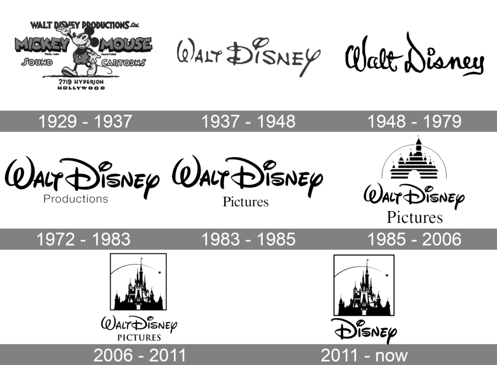
This blog is your magic portal to a deep dive into the history and evolution of the Walt Disney logo. We’ll explore its humble beginnings as a simple “Walt Disney” script in the 1920s, witness its transformation into the iconic castle motif, and delve into the various versions that graced different Walt Disney Productions. We’ll analyze the design principles, the cultural influences, and the strategic decisions that made the logo one of the most recognizable in history.
Join us on this journey as we uncover the secrets behind the castle made for dreams, the disney font that whispers of classic animation, and the shooting star that reminds us of the magic that Disney continues to bring. From the original Walt Disney Pictures logo to its modern iterations, from Mickey Mouse’s playful presence to the majestic Disney castle in Paris becoming a global landmark, this blog will dissect every detail, every transformation, and the enduring legacy it represents.
So, get ready to embark on a magical adventure through the history of Disney – one logo at a time! Prepare to be amazed, to reminisce, and to discover the timeless power of imagination and storytelling that the Disney logo history embodies. Let the wonder begin!

Image Courtesy
Before the Wonder: The History of Disney Brand and Its First Disney Logo (1923-1930s)
The Walt Disney Company sprouted from humble beginnings in 1923, founded by the Disney brothers. During this period, animation was still in its nascent stages, and the Walt Disney Studios early variation of the logo reflected this nascent stage. The first Disney logo, designed in 1923, was a simple affair – a serif font spelling out “Walt Disney,” mirroring the founder’s signature and embodying the small Disney brothers’ studio personality. This logo design marked the dawn of a journey fueled by Walt Disney’s tenacity and passion for storytelling.
The Rise of Mickey Mouse and the Birth of an Icon (1930s-1940s)
Everything changed with the arrival of Mickey Mouse in 1928. This beloved character quickly became the company’s mascot, and it wasn’t long before he made his iconic debut in the logo design. In the 1930s, the Walt Disney Pictures logo retained the original font, but incorporated Mickey’s playful silhouette, marking the birth of an enduring icon. This shift resonated with the growing popularity of Disney, symbolizing the company’s entrance into the mainstream and the magic it was bringing to audiences worldwide.
From Black and White to Technicolor: Expanding the Disney Castle Universe (1950s-1960s)
As the company ventured into feature films like “Snow White and the Seven Dwarfs” and diversified its content, the previous logo design needed to adapt. The arrival of color in the 1950s brought a vibrant touch, and the Mickey silhouette became more stylized. Cinderella’s Castle, inspired by Disneyland’s Sleeping Beauty Castle, also made its debut in the logo, hinting at the fairy tale magic that had become a cornerstone of the Disney brand. This logo evolution mirrored the company’s expansion and its growing focus on Disney theme park experiences, solidifying its commitment to creating wonder and enchantment.
A Legacy Forged in Steel: The Walt Disney World Era (1970s-1980s)
The opening of Walt Disney World in 1971 marked a monumental shift for the company. This ambitious theme park project not only solidified Disney’s global brand recognition but also laid the foundation for further diversification and expansion. The logo design reflected this evolution, becoming more stylized and sophisticated. The font remained bold but gained a cleaner, more modern feel. However, the most significant change was the introduction of the iconic Cinderella castle as a central element. This majestic centerpiece, inspired by Disneyland’s Sleeping Beauty Castle, embodied the grandeur and magical experience that Disney World promised. It seamlessly blended with the “Walt Disney Pictures” text, creating a unified and instantly recognizable Disney logo.
This period also saw Disney venturing into international markets, opening Tokyo Disneyland in 1983 and Euro Disneyland (now Disneyland Paris) in 1992. The walt disney pictures logo, with its universal theme of wonder and enchantment, remained consistent despite these cultural and geographical expansions.
From Hand-Drawn to Digital: The Modern Era of Disney Logo Design(1990s-Present)
The rise of CGI animation and technological advancements in the 1990s ushered in a new era for Disney. While the core logo design principles remained – clean lines, bold colors, and a touch of whimsy – the logo adapted to the digital age. The lines became sleeker, the colors brighter, and the castle logo underwent subtle refinements. Different versions of the logo emerged for various subsidiaries like Disney Channel, showcasing the company’s ever-expanding universe.
This era also saw Disney acquire major studios like Pixar and Marvel, further diversifying its content and audience reach. Despite these acquisitions, the current logo, with its timeless design and enduring castle motif, remained a unifying symbol for the entire Disney company.
The Magic Endures: What We Can Learn from the Walt Disney Logo
From its humble beginnings to its global status, the history of the Disney logo offers valuable lessons in branding and design. We can see how the logo:
- Evolved with the company: It adapted to reflect Disney’s growth, diversification, and technological advancements, ensuring continued relevance.
- Maintained core values: The logo design consistently conveyed the brand’s essence of wonder, imagination, and storytelling.
- Leveraged simplicity: The Disney logo, both in its original and current iterations, uses clean lines and a clear color palette, making it instantly recognizable across generations and cultures.
- Incorporated storytelling: The castle logo, inspired by iconic Disney movies, tells a visual story that resonates with audiences worldwide.
The Disney logo reminds us that a successful brand identity doesn’t require constant reinvention. Instead, it’s about staying true to your core values while adapting to the changing times. It’s also a testament to the enduring power of imagination and storytelling, reminding us that the magic Disney creates continues to captivate audiences of all ages.
Wrapping Up: Changed Over the Years, Yet Forever Disney
The Disney logo isn’t just a piece of graphic design; it’s a portal to a world of imagination, a symbol that has captivated generations. Its journey, from the original logo featuring the name of the founder to the iconic castle adorned with a shooting star, reflects the company’s evolution while holding onto its core values.
Through the years, the logo has donned different hats: showcasing Mickey Mouse’s playful charm, embracing vibrant colors and animation, and welcoming the magical castle, forever etched in our minds by classic Disney films. Despite these transformations, the Walt disney pictures logo has always retained its essence – a touch of whimsy in the font, a bold use of color, and an unwavering focus on storytelling.
This enduring legacy isn’t just a testament to Walt Disney’s tenacity and vision; it’s a reminder of the power of imagination and the magic that storytelling holds. The logo simply is not a brand identifier; it’s an invitation to dream, to believe in happy endings, and to embark on adventures alongside beloved characters.
But the magic doesn’t stop there. The current logo is still its lighter shade of blue and streamlined castle, reflecting a modern touch while retaining its timeless appeal. The animated logo appeared before every Disney movie, reminding us of the shared childhood memories, the laughter, and the wonder that Disney has brought to families worldwide.
So, the next time you see the Disney logo, remember: it’s more than just a design. It’s a symbol of a legacy, a promise of magic, and a reminder that the power of imagination can truly move mountains (or build castles!). What story will you create today?


