Confession of An Infographic Design Guru: My Designing Infographic Secrets
Confession time: back in college, I tried creating an infographic to explain the economic impact of the avocado toast craze. It was…well, let’s just say it resembled a digital explosion more than a data-driven masterpiece. I crammed every statistic I could find, used Comic Sans for “maximum relatability,” and ended up with a confusing mess that sent shivers down any self-respecting designer’s spine.
That’s where my journey as an infographic design guru began. Obsessed with transforming complex data into captivating visuals, I devoured design principles, experimented with countless tools, and even (don’t tell anyone) befriended a data scientist (they have the coolest datasets!). Now, years later, I’m here to share the hard-won secrets that turned my infographic disasters into viral successes.
Forget “infographic in 5 steps” or “ultimate infographic design guide” nonsense. This blog is about peeling back the curtain and revealing the real magic behind killer visual representation. Think of it as your insider’s access to the design dojo, where we’ll explore:
- The data whisperer’s handbook: Learn how to tame complex data sets and extract the stories they’re begging to tell.
- Design thinking for the visually challenged: Master the art of choosing the right fonts, colors, and layouts to make your infographic sing, even if you think web design is witchcraft.
- From “meh” to masterpiece: Discover the secret ingredients that transform a basic infographic into a visually stunning and emotionally resonant experience.
- Beyond the template trap: Uncover the power of customizing pre-made templates and unleashing your design creativity (without making things explode).
- Crafting the perfect infographic copy: Learn how to write text that complements your visuals and guides viewers through your story, like a visual sherpa.
So, whether you’re a seasoned designer looking to up your game or a complete newbie who just wants to avoid another Comic Sans catastrophe, this blog is your roadmap to first infographic mastery. Buckle up, grab your metaphorical design wand, and prepare to transform your data into visual magic!
Let’s Explore the Magic of Designing Infographic
What are infographics, and why are they magical?
Infographics are graphic representations of information that use compelling visuals to tell a story and communicate ideas effectively. They’re like data superheroes, transforming complex information into easily digestible and visually appealing formats.
Why are they so powerful?
- Increased engagement: People are drawn to visuals, and infographics capture attention much more readily than text alone. Studies show they can boost engagement by up to 80%!
- Enhanced data comprehension: Visualizing data makes it easier to understand, remember, and compare information. Complex numbers and design trends become clear and relatable.
- Versatility: From explaining a process to showcasing statistics, infographics can be adapted to various communication goals and audiences.
Different types of infographics spell:
There’s an infographic type for every message! Informational infographics explain concepts clearly, statistical infographics highlight data trends, timeline infographics visualize historical events, comparison infographics showcase differences, and flowchart infographics guide users through a process. It’s all about choosing the right spell for your communication magic!
From Data Visualization to Dazzle: My Best Practices for Great Infographic Design Process
My secret potion for infographic alchemy:
- Know your audience: It’s not about you, it’s about them! Understanding their needs, preferences, and knowledge level is crucial for crafting a good infographic that resonates.
- Data visualization is key: Treat your data like a precious ingredient. Choose the best chart type (pie, bar, line, etc.) based on your data and message. Remember, clarity is magic!
- Design doesn’t have to be scary: Don’t worry, I won’t throw confusing jargon at you. We’ll explore basic design ideas like color, layout, and fonts for your infographic that’s both beautiful and functional.
Remember, the magic is in the details:
- Use Infographic Maker if you’re new to the potion-brewing world. Using infographics design tools offer templates and design elements to help you get started.
- Pick an infographic template that fits your data and message. Don’t force a square peg into a round cauldron!
- Craft a captivating title that grabs attention and accurately reflects the purpose of your infographic.
- Keep your infographic concise and focused. Don’t overload it with information – remember, less is often more.
Best Design Elements to Make an Infographic
Don’t let your entire design of infographic be a karaoke disaster! Just like a talented singer needs the right music, your body of the infographic needs the right design elements to truly shine. Here are the key ingredients for a visually stunning and impactful infographic:
1. Color Palette: Your Mood Maestro
Colors for your infographic aren’t just pretty decorations – they set the mood and tone of your infographic. Choose a palette that aligns with your message and resonates with your audience. Think calming blues for financial data, vibrant oranges for a playful brand, or bold reds for a call to action. Remember, color psychology is real!
2. Typography: The Voice of Your Story
Imagine your infographic trying to sing with a kazoo – not a good look, right? Fonts play a crucial role in readability and hierarchy. Choose a clear, easy-to-read typeface for your body text and a complementary font for headings and titles. Don’t forget about font size and weight – they create a visual hierarchy that guides readers through your message.
3. Imagery & Icons: Visual Storytelling at Its Finest
Words are great, but visuals are even better! High-quality images and icons can break up text, add personality, and instantly convey complex information. Choose relevant visuals that complement your data and message. Remember, blurry photos or generic icons won’t impress anyone.
4. White Space: Your Infographic’s Breathing Room
Don’t cram everything into one space like a jam-packed subway! White space is essential for balance and flow. Use it to separate sections, highlight key points, and give the rest of the infographic a clean, modern look. Think of it as the silence between musical notes – it allows each element to resonate more powerfully.
Using an Infographic Template Toolbox
Templates: Friend or Foe?
Infographic templates can be a double-edged sword. They offer a quick and easy starting point, especially for beginners, but they can also limit creativity and individuality.
Choosing the Right Infographic Template That Fits:
- Match the template to your data and message: Don’t force a square peg into a round hole! Choose a template that supports your data type and storytelling style.
- Consider your design experience: If you’re new, a template with pre-designed elements can be helpful. Experienced infographic designer may prefer more flexibility.
- Look for customization options: Choose a template that allows you to adjust colors, fonts, and layouts to reflect your brand and style.
Free Infographic Template Treasures:
- Freepik: Offers a vast library of free infographic templates in various styles.
- Canva: Provides a user-friendly interface with a good selection of free templates.
- Piktochart: Offers a limited selection of free templates, but they’re high-quality and well-designed.
A Step-by-Step Design Tips to Creating an Infographic
Ready to transform your data into a masterpiece? Buckle up, because this step-by-step guide will equip you with the magic wand to create an entire infographic that sings!
Step 1: Choosing an Infographic Weapon
Before diving in, identify your mission. What story do you want to tell? What type of data do you have? Here’s your arsenal:
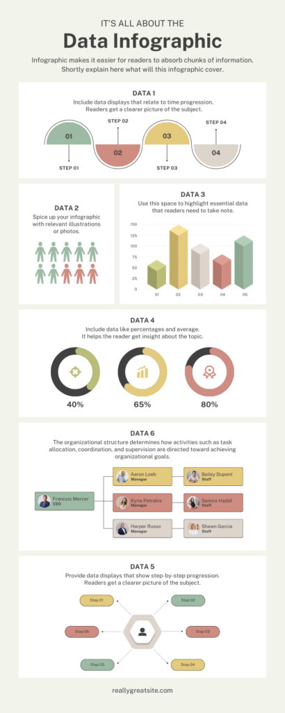
Statistical Infographic: Ideal for showcasing data trends and comparisons, like this insightful infographic.
Statistical Data Infographic
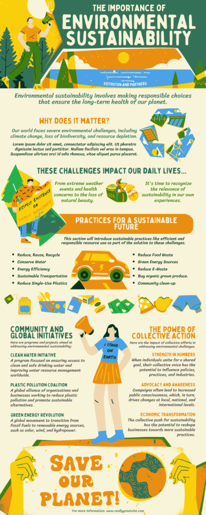
Informational Infographic: Perfect for explaining complex concepts clearly, like this
Information Infographics
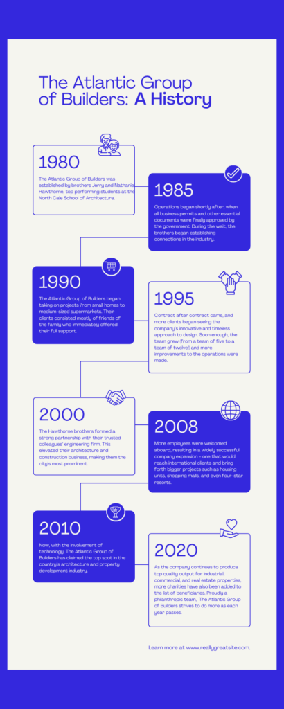
Timeline Infographic: Visualize historical events or processes chronologically, like this captivating infographic
Timeline Infographic
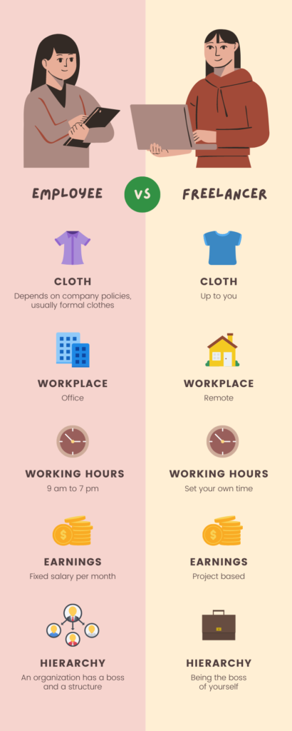
Comparison Infographic: Highlight differences between things, like this informative infographic that shows the difference between freelancers and employees.
Comparison Infographics
How-to Infographic: Guide users through a process step-by-step, like this helpful infographic on how to make egg noodles.
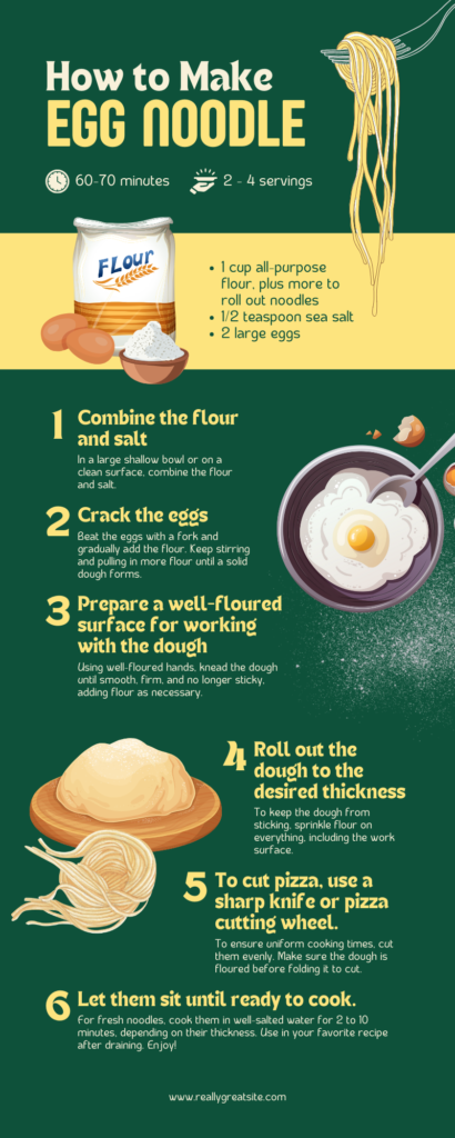
How to- Infographics
Remember: Choosing the right type of infographic is crucial for maximizing your impact. Don’t force a square peg into a round hole!
Step 2: Gather Your Data Armaments
Now, assemble your data army! Make sure your infographic should be accurate, relevant, and easy to understand. Make sure you know, less is often more. Focus on the key points that support your message and discard the rest.
Step 3: Design Your Effective Infographic Battlefield
Template or freehand? The choice is yours!
- Template Warriors: For beginners, templates offer a structured starting point. Explore sites like Canva, Piktochart, or Freepik for a diverse selection.
- Freehand Champions: Experienced designers might prefer the flexibility of software like Adobe Illustrator or Photoshop.
Pro Tip: Choose a tool that allows customization to add your unique touch.
Step 4: Deploying Visuals & Text Artillery
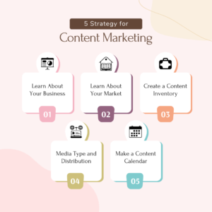
Visuals are your secret weapons! Use high-quality images, icons, and illustrations that complement your data and message. Remember:
- Clarity is key: Ensure visuals are easy to understand and don’t overload your infographic.
- Strategic placement: Position visuals to guide the reader’s eye and reinforce your message.
- Text as a supporting element: Keep text concise and use bullet points or short sentences for easy reading.
Step 5: Craft a Captivating Title For Your Infographic

Your title is the first impression, so make it count! Here’s the formula:
- Clear and concise: Briefly explain your infographic’s topic.
- Intriguing and relevant: Spark curiosity and entice readers to explore.
- Keyword-rich: Optimize for search engines (but don’t stuff keywords unnaturally).
Example: Instead of “Global Internet Usage Statistics,” try “The World Wide Web: A Connected Planet in Numbers.”
Bonus Step: Common Mistakes to Avoid
- Infographic Overload: Don’t cram too much information in. Keep it focused and digestible.
- Final Design Disasters: Clashing colors, illegible fonts, and poor layout sabotage your message. Use design principles effectively.
- Data Blunders: Ensure data accuracy and avoid misleading representations.
- Copy Catastrophe: Proofread meticulously! Typos and grammatical errors hurt credibility.
By following these steps and avoiding these pitfalls, you’ll be well on your way to creating effective infographics that resonate with your audience and achieve your communication goals. Remember, practice makes perfect! Don’t be afraid to experiment and have fun in the process!
Conclusion
There you have it! You’ve unlocked the secrets to crafting compelling infographics that inform, engage, and inspire. Remember, the magic lies in these key takeaways:
- Infographics are powerful communication tools: They transform complex data into easily digestible and perfect for visualizing formats, boosting engagement and comprehension.
- The right type of infographic matters: Choose the format that best suits your data and message, whether it’s informational, statistical, timeline-based, or comparative.
- Design plays a crucial role: Utilize color, typography, imagery, and layout strategically to create a visually harmonious and impactful infographic.
- Data is your foundation: Ensure your data is accurate, relevant, and presented clearly. Remember, less is often more!
- Practice makes perfect: Don’t be afraid to experiment and learn from your mistakes. The more you create infographics, the more confident and skilled you’ll become.
But wait, there’s more!
There you have it – the secrets behind crafting infographics that truly captivate. Remember, an infographic is more than just pretty pictures. It’s a strategic tool to convey complex information in a digestible and engaging way.
By following these principles, you’re well on your way to creating infographics that not only inform but inspire. But if you feel overwhelmed or simply want to elevate your designs to the next level, let professional design agency like Leostar be your guiding star. Our team of infographic experts is passionate about transforming data into visual storytelling masterpieces.
Let’s collaborate to create an infographic that leaves a lasting impression. Contact us today to discuss your project!


