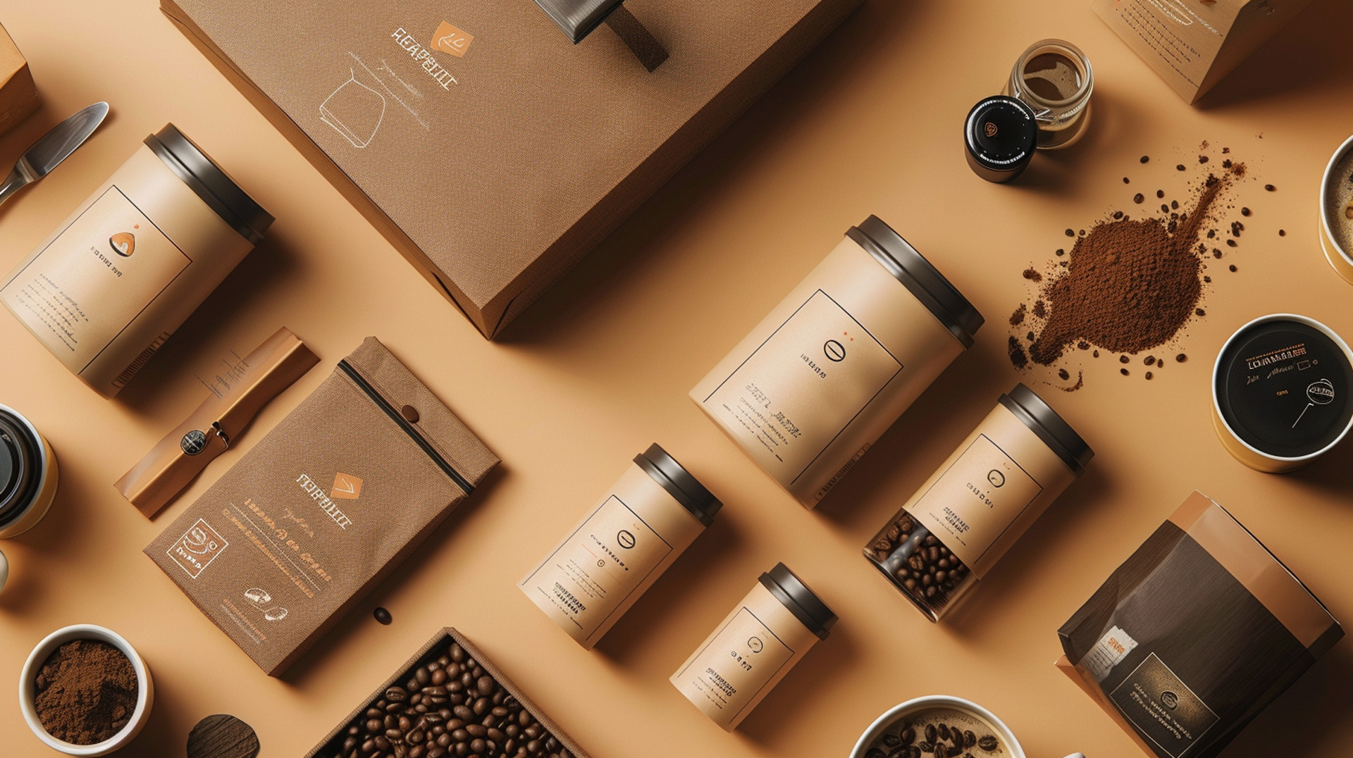
Matching Coffee Packaging Design Ideas For Different Roasts
Ah, coffee. The mere mention of your favorite coffee already brings to mind the rich aroma, comforting warmth, and essential boost we crave in the morning (or afternoon). However, aside from the delightful beverage itself, there’s a key factor that captures our attention: the coffee packaging design.
Imagine, browsing through a store shelf filled with choices – what motivates you to pick up a specific coffee bag? Well, you know it very well, it’s the packaging that catches your eye first.
Now, let’s dive deeper into this coffee world. Just as the taste of coffee varies depending on the roast, the design of the coffee packaging should also reflect this diversity. Let’s explore the fascinating world of coffee roasts and discuss how to craft a customized coffee packaging design that perfectly complements each coffee type.
A Roast by Roast Guide to Coffee Packaging Design
Before we delve into the specifics of design, let’s take a moment to look and feel at the captivating world of coffee roasts. In general, great coffee beans fall into three primary categories: light, medium, and dark. Each type of roast brings its own unique flavor profile and preferred brewing method, making it crucial to grasp these differences when designing eye-catching and impactful coffee packaging design.
Light Roasts:
These beans undergo a shorter roasting process, resulting in a coffee that is lighter in color with vibrant, tangy notes and a delicate body. Light roasts shine best when brewed using pour-over methods or as filter coffee, allowing their subtle flavors to come to the forefront.
Medium Roasts:
Considered the “Sweet Spot”, this medium roasts coffee has been on the favorite list among many coffee lovers. They offer a harmonious blend of acidity and body, showing richer flavors of caramel and chocolate. Medium roasts are versatile companions for brewing styles like drip coffee, french press, and even espresso.
Dark Roasts:
Roasted for a longer duration, dark roasts present a bold and intense flavor profile with hints of smokiness or bittersweetness. With lower acidity and a fuller body, they are well-suited for creating robust brews such as espresso or cold brew.
Best Coffee Packaging Design Ideas for Each Roast
Now that we’ve explored the roasting spectrum, let’s see how we can translate these characteristics into designing effective coffee packages:
Light Roasts:
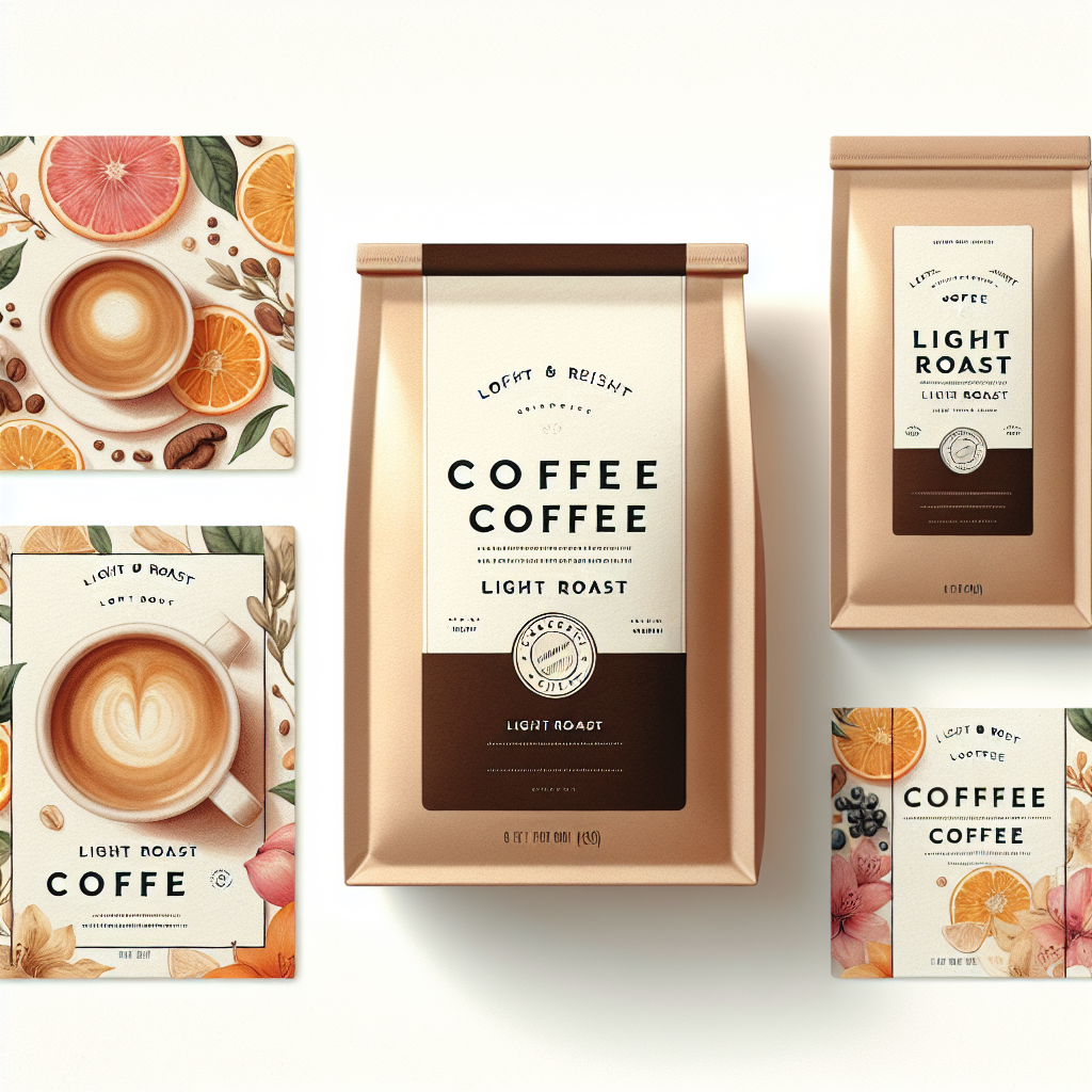
- Bright Color Schemes: Think light and airy. Opt for pastels, yellows, or light blues to reflect the bright and acidic nature of the roast.
- Minimalist & Elegant Fonts: Keep the typography clean and simple, allowing the vibrant colors to take center stage. Think sans-serif fonts with good readability.
- Images Highlighting Fruity Notes: Showcase vibrant fruits like citrus, berries, or stone fruits on your coffee packaging design. These visuals will hint at the light roast’s unique flavor profile.
Pro Tip: Consider incorporating illustrations or watercolor art for a touch of elegance and a connection to the natural world.
Medium Roasts:
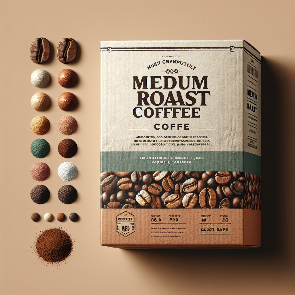
- Earthy Color Palettes: Medium roasts call for a more grounded approach. Use browns, beiges, or muted greens to reflect the balanced and smooth taste experience.
- Classic & Readable Typography: Maintain a classic and legible font style. Serifs can enhance the timeless feel associated with medium roasts.
- Images Representing Balanced Flavors: Opt for photographs or illustrations that depict coffee beans alongside complementary elements like nuts, chocolate, or caramel. This visually communicates the balanced flavor profile.
Pro Tip: Explore the use of textures like linen or kraft paper to exude a sense of quality and craftsmanship.
Dark Roasts:
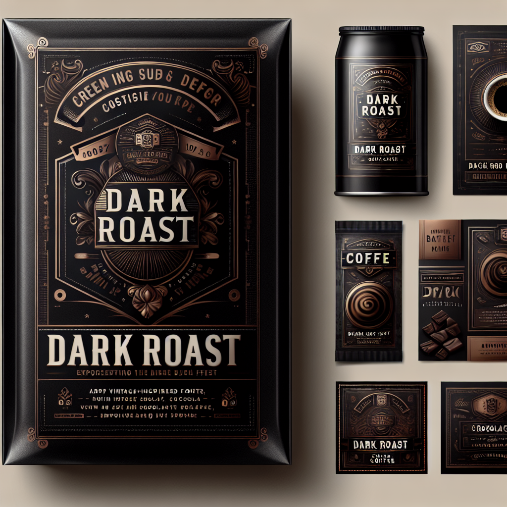
- Bold & Dark Color Tones: Embrace the intensity of dark roasts with deep browns, blacks, or even metallic accents like gold or silver.
- Vintage-Inspired Fonts: Vintage fonts with a hint of flourish add a touch of sophistication and complement the bold taste of the coffee.
- Images Conveying Richness & Intensity: Use dark chocolate visuals, smoky swirls, or even illustrations of strong brewing methods to convey the powerful flavor profile of dark roasts.
Pro Tip: Experiment with matte finishes or embossed logos to add a premium feel to your dark coffee beans on the packaging.
Final Thoughts on Design and Roast for Your Coffee Brand
When you understand the unique traits of each coffee roast and infuse them into your design, you can craft sustainable coffee packaging design that resonates deeply with coffee lovers. Always, remember, that the ideal packaging serves as a direct reflection of the coffee itself – visually narrating the exciting flavor journey that lies within.
Feel free to play with colors, fonts, and visuals to create a design that shines on the shelf and authentically conveys your coffee’s character. In the world of coffee packaging design- both the fresh coffee roast and the design should be honored!
Are you ready for coffee packaging design that harmonizes perfectly with your roast and captivates your audience?
Choose LeoStar – The Professional Packaging Design Agency in the USA.
Our team of skilled designers is dedicated to creating unique and custom packaging that shares the story of your beloved coffee. We understand very well how aligning design with the quality of your coffee roast characteristics, and we’re committed to collaborating closely with you to develop entire coffee packaging design that enhances your brand identity and attracts coffee lovers to choose your product.
Get in touch with LeoStar today for a free consultation and let’s brew up some packaging magic!
