Hero Images in Web Design: What, When, Why, and How to Use
Where attention spans are shorter than ever, making a great first impression is important, especially in web design. This is where dynamic hero images in web design step in. These striking visuals act as the captivating billboard of your website, grabbing visitor’s attention right from the top of the page. When used smartly, a hero image can totally transform your website, boosting engagement and getting those conversations rolling.
What are Hero Images in Web Design?
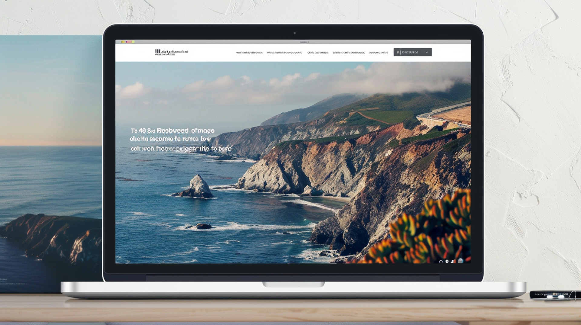
Hero images in web design, also called hero banners or sections are those big, impactful visuals that sit proudly on a webpage, usually at the very top. Being in this prime spot means they’re the first things visitors notice when they jump onto your site. They can be photos, illustrations, videos, or even cool interactive elements, all working together to instantly get your message across swiftly and effectively.
Why Use Hero Images?
There are several compelling reasons to incorporate hero images in web design strategy:
- Grab Attention in a Flash: In a world filled with distractions, you only have a few seconds to make a positive impression on visitors. A well-crafted hero design can stop visitors in their tracks and entice them to explore further.
- Communicate Value Proposition Instantly: People process visuals much faster than text. A hero image can instantly convey the essence of your brand, the purpose of your webpage, or the benefits you offer.
- Evoke Emotion and Build Connection: The right image can spark positive emotions and create a connection with visitors. Think about how a photo of a happy family using your product can make visitors feel warm and fuzzy, or how a breathtaking landscape image can inspire them.
- Improve Website Navigation: Hero images in web design can be a subtle yet powerful tool to guide visitors towards the most important sections of your webpage. By strategically placing a call to action (CTA) button or using visual cues within the image, you can nudge visitors in the desired direction.
When to Use Eye-Catching Hero Images?
While hero images in web design are a versatile tool, there are some situations where they shine especially bright:
- Homepage Hero: This is a no-brainer. Your homepage is the gateway to your website, and a hero image sets the tone for the entire user experience. Use it to showcase your brand personality, introduce your key offerings, or promote a special campaign.
- Landing Pages: Landing pages are designed with a single goal in mind, whether it’s capturing leads, generating sales, or driving registrations. A hero image on a landing page should be laser-focused on this goal, communicating the value proposition and compelling visitors to take action.
- Key Internal Pages: Hero images in web design aren’t restricted to the homepage and landing pages. Consider using them on important internal pages to visually represent the content and guide users towards relevant sections. For example, a product page might benefit from a hero image showcasing the product in action.
How to Use Hero Images in Web Design Effectively
Now that you understand the power of hero images in web design, let’s delve into how to use them effectively:
- High-Quality Hero Image is Essential: Your hero image is a reflection of your brand, so ensure it’s visually stunning and high-resolution. Grainy, pixelated images will leave a negative impression.
- Mobile-Friendly Design: The majority of web traffic comes from mobile devices. Make sure your hero image resizes and adapts seamlessly to different screen sizes for optimal viewing on any device.
- Balance with Text: While the image is the star of the show, don’t neglect the power of concise and clear text. Overlay the image with a compelling headline, tagline, or CTA to reinforce your message.
- Call to Action: A strong CTA button within the hero image area can significantly boost conversions. Tell visitors exactly what you want them to do next, whether it’s “Shop Now,” “Learn More,” or “Download Our eBook.”
- Emotional Resonance: People connect with emotions. Choose a beautiful hero image that evokes positive feelings relevant to your brand, product, or service.
- Brand Alignment: Your hero image should be visually aligned with your overall brand identity. Consider factors like the basic color of the hero image, style, and imagery to create a cohesive user experience.
Great Hero Image Inspiration
Hero images in web design can be static images, but there’s a whole world of creative possibilities to explore:
- Slideshows: Showcase multiple images or even short videos in a captivating slideshow format within the hero section.
- Interactive Elements: Add a touch of interactivity with hover effects, parallax scrolling, or other animations that grab attention.
- User-Generated Content: Featuring user-generated content in your hero image can add a touch of authenticity and social proof, building trust with visitors.
Measuring the Success of Your Perfect Hero Image in Web Design
After adding hero images in web design, it’s crucial to keep an eye on how they’re doing and how users are responding. Here are some important things to track.
- Click-Through Rate (CTR): If your hero image includes a CTA button, track the CTR to see how many visitors are clicking through. A high CTR indicates the image is effectively driving engagement.
- Bounce Rate: The bounce rate is the percentage of visitors who leave your website after viewing only one page. A lower bounce rate on pages with hero images suggests they’re keeping visitors interested.
- Time Spent on Page: The amount of time visitors spend on a page with a hero image can indicate how well it’s capturing attention. Aim for longer dwell times to suggest the image is sparking interest.
By keeping an eye on these metrics and trying out different hero image styles using A/B testing, you can keep improving them to make the most impact.
Also Read-
5 Great Website Design Examples & Tips from Award-Winning Websites
Wrapping Up The Best Practices of Using Hero Images in Web Design
In simple terms, hero images in web design are like the exciting first sentence of a story. They set the mood, spark curiosity, and draw people in. By including carefully chosen and full-screen hero images in web design, you can craft a website that grabs attention, connects with your audience, and drives results.
Remember, making a great first impression online is crucial, and your hero image is often the very first thing visitors are gonna see. So aim for excellence! LeoStar’s custom web design service is here to assist you in creating custom hero images in web design that not only look amazing but are also designed strategically to achieve your goals.
Our team of web design pros understands how powerful hero images can be and knows how to use them effectively to build impressive websites. We’ll team up with you to grasp your brand, target audience, and aims, crafting hero images in web design that capture your essence and message perfectly.
Ready to design a winning hero image for your website?
Reach out to LeoStar today for a free consultation. Let’s work together to craft a website that impresses visitors right from the start and keeps them engaged.


