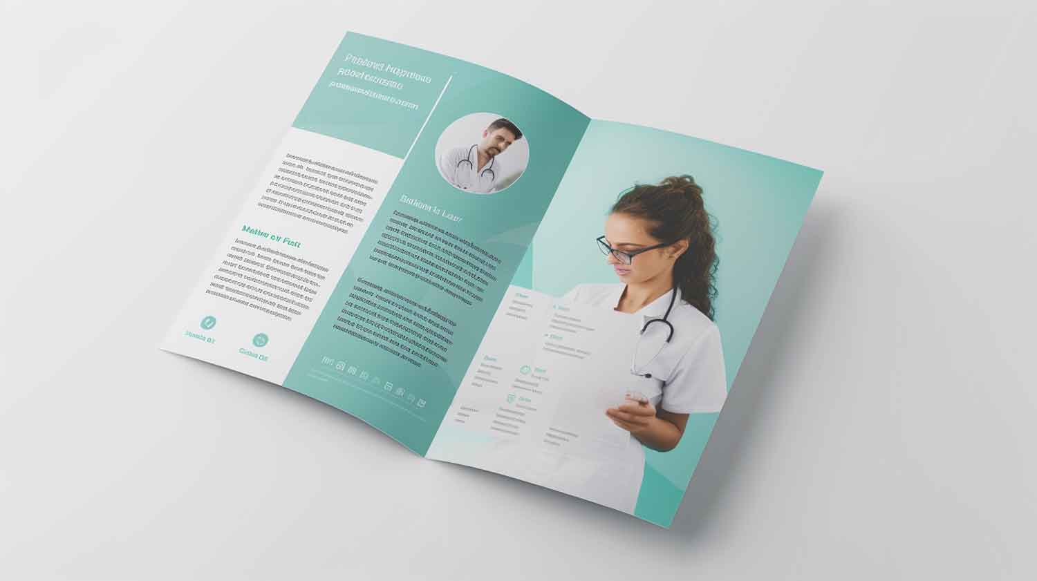
Basic Flyer Design Tips 101: Guide to Flyer Design That Won’t Get Thrown Out
Are you tired of pouring your heart and soul into designing flyers, only for them to end up in the trash? Look no further! In our blog post, we’ve got you covered with expert advice and strategies to create captivating flyers that leave a lasting impression.
Discover the secrets behind visually stunning designs and learn how to effectively communicate your message while grabbing the attention of your target audience. From layout and color choices to typography and imagery, we’ll provide you with invaluable tips to ensure your flyers not only stand out but also generate the desired response. Say goodbye to wasted efforts and hello to flyer designs that truly make an impact!
Introduction
When you’re looking to make a good flyer, it’s important to consider the design, just like you’re creating a flyer that will catch your attention and deliver your message effectively.
Flyers are versatile tools that can be used for various purposes, from advertising flyers to promoting events or businesses. By using a flyer, you have the opportunity to make your flyer design, incorporating colors into your flyer design that align with your brand.
Consider utilizing a flat design for a modern and clean look. With so many flyer uses, from online flyers to corporate flyers, you can explore different styles to find what works best for you. If you want your flyer to stand out, focus on top flyer design techniques that will help your flyer make a memorable impact.
Distributing a flyer, dividing your flyer into sections, and incorporating design moves will ensure your flyer catches attention. Additionally, utilizing templates that you can use as a starting point will make it easier to create an eye-catching design. Incorporating a stunning flyer into your marketing campaign can greatly enhance its effectiveness and leave a lasting impression on your target audience.
Understanding the Basic Flyer Design Concept
Before diving into the world of professional flyers, it’s crucial to grasp the fundamentals. A stunning flyer serves as the canvas for your message, and its design can significantly impact its effectiveness. Consider factors such as flyer sizes, dimensions, and the use of colors to create a visually appealing and well-designed flyer.
When designing the flyer, keep in mind that simplicity often leads to elegance. Use a clean design style and incorporate design features that align with your message. Throughout the flyer, maintain a pleasing and appealing design to capture the audience’s attention.
Choosing the Right Business Flyer Template
Selecting the appropriate flyer template is a critical step in the design process. Explore creative business flyer templates that align with your industry and marketing goals. Templates provide a foundation for your design, making it easier to create a professional-looking flyer with minimal effort.
Consider standard flyer dimensions and choose a template that allows for customization. This ensures that your flyer is not only visually appealing but also tailored to your specific needs. The right template can be a game-changer in creating a top flyer for your marketing campaign.
Importance of Effective Flyer Design Idea
Effective flyer design is crucial for several reasons. Firstly, it helps create a strong visual impact and grabs the attention of your target audience. The best one flyer can make a lasting impression and increase the chances of people engaging with the content.
Secondly, an appealing flyer design ensures that your message is communicated clearly and concisely. With limited space available on a flyer, every element needs to be strategically placed to deliver the key information effectively.
Moreover, a professionally designed flyer adds credibility to your business or event. It showcases your attention to detail and professionalism, which can instill trust and confidence in potential customers.
Additionally, flyers provide a tangible marketing tool that can be easily distributed and shared. Unlike digital ads that can be easily ignored, a physical flyer has a higher chance of being noticed and kept for future reference.
In summary, an eye-catching design of a flyer is essential for capturing attention, communicating your message clearly, enhancing credibility, and providing a tangible marketing tool for distribution.
Basic Flyer Design Tips and Design Principles for Success
If you prefer a more personalized approach, creating your own flyer can be a rewarding experience. Start with a design concept that resonates with your brand identity. Incorporate creative flyer design ideas that reflect your style and message, making the flyer uniquely yours.
Throughout your flyer design process, pay attention to the placement of text, images, and other elements. Designing a professional flyer involves a thoughtful arrangement that guides the viewer’s eye and communicates your message clearly. As you embark on designing your flyer, keep in mind the principles of unique flyer design.
Compelling Headlines in Basic Flyer
• How to grab attention with strong headlines
The headline of your flyer is the first point of contact with your audience, and it needs to grab their attention immediately. To create stunning flyers and compelling headlines, consider using text in your flyer such as power words and action-oriented language.
• Examples of attention-grabbing headlines
Words like “discover,” “unleash,” “ultimate,” or “exclusive” create a sense of urgency and intrigue. Additionally, posing thought-provoking questions or making intriguing statements can captivate readers’ interest. For example, instead of simply stating “New Product Launch,” you could use a headline like “Unlock the Secrets to a Revolutionary New Product.” Experiment with different headline styles and analyze the impact they have on reader engagement.
Visual Hierarchy to Design Your Flyer
• Creating a clear flow of information to design a flyer
Creating a clear flow of information is essential in a pleasing design. The visual hierarchy involves arranging elements on the flyer in a way that guides the reader’s eye through the content in a logical manner. Start by identifying the most important information that you want to highlight, such as the headline, key benefits, or call-to-action.
• Using typography and layout to guide the reader’s eye
Utilize typography, such as larger fonts or bold text, to emphasize these key elements. Consider using subheadings, bullet points, or icons to break up the text and make it more scannable. By organizing the content effectively, you can ensure that readers can quickly understand the main message of the flyer.
Color Psychology in Well-Designed Flyer
Colors have a significant impact on emotions and perceptions. Understanding color psychology can help you choose the right colors that align with the message and target audience of your flyer.
For example, blue is often associated with trust and reliability, while red can create a sense of urgency or excitement. Consider your brand identity and the emotions you want to evoke in your audience when selecting colors for your flyer. Additionally, ensure that the colors you choose are visually appealing and create a harmonious overall design.
Simplicity and Minimalism for Perfect Flyer
• Why less is more in flyer design
In flyer design, less is often more. A cluttered and overwhelming design can confuse readers and make it difficult for them to understand the key message. Embrace simplicity and minimalism by focusing on the essential information and eliminating unnecessary elements.
Use white space effectively to create breathing room and draw attention to important elements. Opt for clear and legible fonts to ensure readability. By keeping the design clean and uncluttered, you allow the main message of the flyer to shine through.
Basic Flyer Design Case Studies and Examples
• Successful flyer campaigns and their basic design elements
Use interesting design elements: Incorporate visually appealing photography, shapes, and icons in your flyer to make it stand out. Source: Venngage Blog
Have a clear flyer strategy: Define your target audience and create a strategic plan for distributing your flyers effectively. Source: Concept Store
Repeatedly send out flyers: Promote your services by consistently distributing flyers to increase brand awareness and reach. Source: Concept Store
Focus on print quality: Pay attention to the final print finish of your flyers, as it can be just as important as the design itself. Source: MARQ Blog
Examples of Successful Print Design Campaigns:
- The Obama Hope Poster
- The Got Milk? Campaign
- The Absolut Vodka Ads
- The Rolling Stone Covers
- The iPod Silhouettes Source: LinkedIn
• Common mistakes to avoid in flyer design
- Using too much text
- Overcrowding the design
- Neglecting a clear visual hierarchy Source: CoSchedule
• Brands that excel in flyer marketing:
While specific brands that excel in flyer marketing may vary, well-known brands often have successful flyer campaigns. Examples include Coca-Cola, Nike, Apple, and Starbucks. These brands consistently use creative designs, compelling messaging, and effective distribution strategies to engage their target audience. Source: Research and analysis.
The importance of professional flyer design and the value it brings to flyer campaigns
In conclusion, the importance of professional design cannot be overstated when it comes to creating impactful flyer campaigns. Hiring a professional designer brings immense value to your marketing efforts and can significantly improve the effectiveness of your flyers.
Professional designers possess the expertise and skills necessary to craft visually stunning and engaging designs that align with your brand identity. They have a deep understanding of design principles, typography, color psychology, and layout composition, allowing them to create flyers that captivate attention and effectively communicate your message.
By working with a professional designer, you can ensure that your flyers are visually appealing, easy to read, and strategically structured. They will take into account the target audience, the purpose of the flyer, and your unique selling points to create designs that resonate with your potential customers.
While there are many do-it-yourself tools available for designing flyers, they often lack the finesse and creativity that a professional designer can bring to the table. Investing in professional design services not only saves you time and effort but also elevates the overall quality and impact of your flyer campaigns.
So, when it comes to creating impactful flyers, consider hiring a professional designer. Their expertise and creative vision will help you stand out from the competition, capture attention, and drive meaningful engagement with your target audience.
Remember, first impressions matter, and professional design can make all the difference in ensuring that your flyers leave a lasting and positive impression on your potential customers.
Conclusion
In conclusion, creating a best flyer that stands out and avoids being discarded requires attention to key design elements.
- Keep your messaging clear and concise, using eye-catching flyer design visuals that resonate with your target audience.
- Consistency in branding establishes credibility and recognition.
- Incorporate white space to maintain a clean and organized layout, making it easier for readers to navigate.
- Lastly, include a compelling call-to-action that directs readers on their next steps.
Designing a flyer that truly stands out can seem daunting, but with these basic tips, you’re well on your way to creating a flyer that packs a punch. Remember, a great flyer is more than just a pretty picture – it’s a tool to connect with your audience.
If you’re looking to take your flyer design to the next level, let custom flyer design services by Leostar help. Our team of expert designers can create custom flyers tailored to your unique needs. Contact us today to get started!


